Author: Peter Jansen

  • Should You Care About Exit Pages?

    Should You Care About Exit Pages?

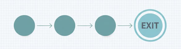
    “Exit Pages” sounds ominous—like a list of places where your site fails. In reality, it’s just the last page in a session. Sometimes that’s a problem. Often, it’s perfectly normal. The trick is separating healthy exits (mission accomplished) from leaky exits (friction, confusion, dead ends).

    Below is a beginner-friendly way to read the Exit Pages report without overreacting—and a simple table you can use to turn raw exits into clear next steps.

    What an exit page actually tells you

    • Definition: The exit page is the final page a visitor viewed before leaving your site.
    • What it is not: It’s not automatically a “bad” page. People also exit after completing their goal—submitting a form, grabbing an address, or reading a single article.
    Last page in a session highlighted on a simple path

    Rule of thumb: Treat an exit as a context signal, not a verdict. Ask what the visitor came to do and whether this page logically ends that journey.

    When exits are totally fine

    • Receipt / thank-you pages. The “mission accomplished” exit.
    • Contact details, store hours, directions. They found what they needed.
    • Long-form content. Single-visit satisfaction is common for educational pieces.
    • External handoffs. App store buttons, marketplace listings, or PDF downloads.
    Examples of healthy exits: thank-you, contact, long read, external handoff

    In these cases, a high exit rate is often a feature, not a bug.

    When exits deserve attention

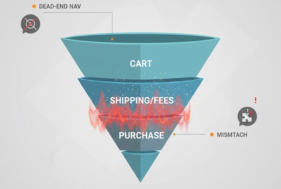
    • Dead-end navigation. No obvious next step from high-intent pages (pricing, features, product pages).
    • Friction moments. Sudden exits on shipping, fees, or error-prone forms.
    • Mismatched promise. Ads or search results promise X; the landing page talks about Y.
    • Thin or duplicate pages. Visitors bail because there’s no substance—or the same info appears elsewhere.
    Funnel with a visible leak at the shipping/fees step

    A quick reading framework for beginners

    1. Anchor to intent. What did this page promise in the journey (discovery, comparison, purchase, support)?
    2. Check it in context. Compare exits against other pages in the same intent bucket.
    3. Layer segments. New vs returning, device, traffic source. A pattern that’s invisible in aggregate often jumps out in segments.
    4. Look left and right. Pair exit rate with scroll depth, time on page, and click-through to primary CTA. A “high exit, high engagement” page is likely delivering value.
    Exit context shown across discover/compare/purchase/support states

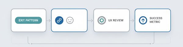
    Translate exits into action (UX worksheet)

    Use (or copy) this table to turn the Exit Pages report into a practical review list. It’s deliberately simple and avoids tools or implementation steps.

    Exit pattern to action worksheet concept.
    Exit pattern (what you see)Likely causeWhat to review (UX view)Healthy vs leaky?Success metric to watch next time
    High exits on Thank-You pageGoal completedIs there a gentle next step? (account setup, resource link)Healthy% of visitors who take a post-conversion micro-step
    High exits on Product page with low add-to-cartInfo gap or anxietyMissing specs, price clarity, trust badges, reviews placementLeakyCTR to cart / request-info from the product page
    Spike in exits on Shipping/fees stepSurprise costsFee disclosure timing, promo code friction, delivery estimatesLeakyCompletion rate for the next step; drop in abandonment
    High exits on Blog post with long read timeSatisfied, no next pathEnd-of-post pathways: related posts, newsletter nudgeUsually healthyCTR on end-of-post modules; newsletter sign-ups
    High exits on Blog post with low scroll depthMismatch or weak introHeadline relevance, first screen clarity, readabilityLeaky% reaching 50% depth; time to first interaction
    Exits from Pricing page after 10–30sDecision frictionPlan comparison clarity, FAQ above the fold, contact optionLeakyClicks to “Talk to sales”/trial; plan switch interactions
    Mobile-only exit spikesMobile frictionTap targets, font size, load time, sticky CTA visibilityLeakyMobile engagement rate; next-page CTR on mobile
    Exits from Support articlesProblem solvedAdd “Was this helpful?” and link to related fixesHealthyHelpful votes; reduction in repeat visits for same query
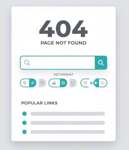
    Exits on 404 / no-results pagesDead endsSearch refinement, popular links, clear languageLeakyRecovery rate from 404 to any helpful page
    404 recovery: search refinement and helpful next links

    How to use it: Pick the top five exit pages by volume, identify their intent, choose a row above that matches the pattern, then define a single success metric to improve. You’ll move from “huh, lots of exits” to “we improved recovery from 404s by 22%.”

    Reading exit pages alongside other beginner-friendly signals

    • Scroll depth: Low depth + high exits = content didn’t hook. High depth + high exits = likely satisfied; add a next step.
    • Time on page: Very short = mismatch or slow load; very long = confusion or deep engagement—check scroll and clicks.
    • Click-through rate to next step: The clearest signal of progress; if it’s low on high-intent pages, prioritize those.
    • Device split: If exits concentrate on mobile, suspect layout, speed, or input friction.
    • Source/medium: High exits from a specific campaign hint at mismatch between ad promise and landing reality.

    Common beginner mistakes with Exit Pages

    1. Treating all exits as failures. Many exits indicate success—don’t “fix” what isn’t broken.
    2. Ignoring volume. A 90% exit rate on a page with 30 visits isn’t the same as 70% on a page with 30,000. Prioritize impact.
    3. Skipping segmentation. Aggregate views hide mobile issues, new-user confusion, or campaign mismatches.
    4. Chasing tiny swings. Look for persistent patterns over time, not one-day blips.
    5. Optimizing without a success metric. Define the “next step” you want—newsletter click, product view, cart add—and measure that, not exit rate alone.

    Quick diagnostic prompts (use them verbatim in your notes)

    • “If this page did its job perfectly, what would the next click be?”
    • “What promises got the visitor to this page, and does the first screen deliver on them?”
    • “Is there at least one obvious path forward for each intent (learn, compare, act)?”
    • “Would a first-time mobile visitor know what to do in three seconds?”
    • “Are exits higher for one traffic source? If yes, what did that source promise?”

    FAQ for newcomers

    Is ‘exit rate’ the same as ‘bounce rate’?
    No. Exit rate applies to any last page in a session. Bounce rate is a single-page session where the visitor leaves without another interaction. A page can have a modest bounce rate but a high exit rate if many people reach it late in their journey.

    What’s a “good” exit rate?
    There’s no universal benchmark. Compare pages within the same intent (e.g., product pages vs product pages). Focus on improving the next-step CTR rather than hitting a magic exit percentage.

    What if my top exit page is the homepage?
    That often signals unfocused navigation or visitors who didn’t find a path. Check top on-page clicks, search usage, and mobile layout.

    The takeaway

    Exit pages aren’t a wall of shame—they’re a map of last touches. Read them through the lens of intent, pair them with simple engagement signals, and use a concise worksheet (like the table above) to decide whether you’re seeing healthy goodbyes or preventable drop-offs. Do that, and your Exit Pages report becomes less of a mystery and more of a to-do list that improves user experience.

  • Facebook Page Insights: What Numbers to Watch

    Facebook Page Insights: What Numbers to Watch

    If you run a small business page, “more likes” is not a strategy. The point of Facebook Page Insights is to show whether your posts reach the right people, spark action, and contribute to sales. Below is a practical, plain-English guide to the few numbers that deserve your attention—and how to read them.

    Start with a one-page scorecard

    Before diving into the metrics, set up a simple monthly scorecard. Keep it to two parts:

    Health (top of funnel)

    • Reach
    • New followers
    • Content mix (posts, Reels, Stories)

    Impact (middle/bottom)

    • Engagement rate
    • Link clicks (or button taps)
    • Message inquiries / leads

    Trends matter more than single-day spikes. Compare week over week and month over month.

    Reach vs. Impressions: how many people you actually touched

    • Reach = the number of unique people who saw any of your content (posts, Reels, Stories, Lives, ads if applicable).
    • Impressions = total views; one person can generate multiple impressions.

    How to read it

    • Rising reach with flat followers usually means the algorithm likes your recent content (good!).
    • Flat reach with growing followers suggests your content isn’t earning distribution—time to adjust formats, hooks, or timing.

    Quick formula
    Reach Efficiency = Reach ÷ Followers. Track it monthly to see if your content is punching above (or below) your audience size.

    Mini visuals comparing reach to impressions with a reach-efficiency gauge

    Followers: growth that actually sticks

    • New Followers (Net) = follows minus unfollows.
    • Where Follows Happened (post, profile, search, invite) shows what attracted them.

    How to read it

    • Spikes tied to a single post? Replicate the format and topic.
    • Unfollows after promotions? Calibrate frequency and targeting—people may like your product, not constant pitches.

    Engagement Rate: the quality filter

    Engagement tells you whether your content resonated enough to earn interaction.

    • Reactions, Comments, Shares, Saves (for Reels) are the high-value actions.
    • Link Clicks show intent to learn or buy.
    • Engagement Rate (by reach) = (Reactions + Comments + Shares + Saves + Clicks) ÷ Reach.

    How to read it

    • Don’t chase raw likes. Comments and shares drive distribution and often correlate with intent.
    • Track ER by content type (posts vs. Reels vs. Stories). If Reels deliver 2–3× the ER, shift your mix.
    shares, saves, and link clicks as engagement signals

    Content diagnostics: what, exactly, worked

    Post-level metrics to sort by:

    • 3-second Plays & ThruPlays (video/Reels) – did the hook stop the scroll?
    • Average Watch Time – stories that kept attention.
    • Link Click-Through Rate (CTR) = Link Clicks ÷ Reach – usefulness of your call-to-action.
    • Saves – intent to revisit (great signal for evergreen or how-to content).
    • Shares – earned new audiences for free.

    How to read it

    • High 3-sec plays but low watch time? Your hook works, story doesn’t—front-load value.
    • High saves but low clicks? Turn the save into a micro-lead magnet (e.g., “comment ‘GUIDE’ to get the PDF”).
    retention, watch time, CTR, and save/share indicators

    Messaging & leads: when interest becomes a conversation

    If you rely on DMs or WhatsApp:

    • New Conversations – count and trend.
    • Response Rate & Median Response Time – speed matters for conversion.
    • Conversation Outcomes – tags like “booked,” “pricing,” “support” (create a simple spreadsheet if needed).

    How to read it
    Fast replies increase close rates. If many chats start from a specific post format (e.g., before-and-after), you’ve found a lead driver.

    post to message, qualified lead, and booked outcome

    Negative signals: the quiet red flags

    • Hides, Unfollows, Report as Spam—watch rate, not absolute numbers.
    • Hide Rate = Hides ÷ Reach.
    • Unfollow Rate = Unfollows ÷ Followers.

    How to read it
    Small businesses often ignore these. Rising negatives usually mean content frequency is too high, targeting is off, or creative feels click-baity.

    Audience insights: who you’re actually reaching

    • Age, Gender, Location – compare to your buyer profile.
    • Active Times – when your audience is most likely to be online.

    How to read it
    If your top cities don’t match your service area, use geo cues in your creative (landmarks, local slang) and refine boosts to local audiences.

    Reels & video: the distribution engine

    Facebook heavily distributes short video. Focus on:

    • Hook retention (first 3 seconds watched).
    • Average watch time and percentage watched.
    • Replays (strong interest).
    • Shares (organic reach multiplier).

    How to read it
    If average watch time is <30% of the video, shorten it or move the payoff earlier. Use comments as prompts (“Want the checklist? Comment ‘CHECKLIST’”) to convert attention into responses.

    Clicks to website: closing the loop

    You can’t manage what you can’t attribute. Use UTM parameters on links and buttons (e.g., “Shop Now,” “Book”). Track in your analytics:

    • Sessions & Bounce Rate from Facebook
    • Conversion Rate by campaign/content
    • Revenue or Leads attributed to Facebook traffic

    How to read it
    A post can have modest engagement but strong click-through and sales. Judge posts by their job—awareness, engagement, or conversion—not a single vanity metric.

    Paid boosts (if you use them): keep it simple

    For boosted posts or ads, watch:

    • Cost per ThruPlay (video), Cost per Click, Cost per Lead/Purchase
    • Frequency (ad fatigue if >3–4 in short campaigns)
    • Quality Ranking / Conversion Ranking (creative resonance)

    How to read it
    Great organic posts make great boosts. If costs rise and frequency climbs, refresh creative or audience.

    Cadence: how often should a small business post?

    • Quality over quota. Two strong posts or Reels per week can outperform daily mediocre content.
    • Consistency wins. Pick a schedule you can sustain for 90 days and evaluate with trends, not day-to-day swings.
    • Mix: 40% value (tips/how-tos), 30% social proof (testimonials, UGC), 20% product, 10% behind-the-scenes/humor.
    Monthly Facebook review layout showing top posts, audience and active times, and UTM-tracked clicks/leads

    A minimal monthly review ritual

    1. Top 5 posts by outcome
      • Awareness winner (highest reach per follower)
      • Engagement winner (highest ER by reach)
      • Clicks/lead winner (highest CTR or leads)
      • One surprise (performed better than expected)
      • One flop (what to stop doing)
    2. Audience & timing check
      • Any shifts in top locations / active times?
    3. Pipeline sanity check
      • DMs/leads from Facebook vs. last month
      • Website traffic and conversions from Facebook (UTM)
    4. Decisions
      • What you’ll do more of, fix, and drop next month.

    Document in one slide. Share with anyone who helps create content.

    Common pitfalls to avoid

    • Overweighting vanity metrics. 100 shares beat 1,000 passive likes.
    • Changing too many variables at once. Test format, hook, and CTA separately.
    • Ignoring creative “first frames.” The opening visual and first line determine reach on short video.
    • Posting at your convenience, not your audience’s. Use Insights’ active times.
    • No call-to-action. Even awareness posts should suggest a next step (save, share, comment a keyword, visit).

    The takeaway

    You don’t need every chart in Facebook Page Insights. Track reach to know you’re being seen, engagement rate to confirm your content resonates, clicks/messages to prove impact, and a couple of negative signals to keep quality high. Review trends monthly, double down on formats your audience loves, and judge each post by the job it’s meant to do. That’s SMM your business can bank on.

  • Multi-Channel Attribution: Solving the Last-Click Attribution Problem

    Multi-Channel Attribution: Solving the Last-Click Attribution Problem

    Last-click is simple—and simply wrong for modern funnels. It credits the final touch (often brand search or direct) and under-values upper- and mid-funnel work that actually created demand. If you’re allocating budget on last-click alone, you’re almost certainly over-investing in harvest channels and starving the ones that plant and nurture. Here’s a pragmatic playbook to move beyond last-click and fund channels according to their real contribution.

    Why last-click fails (and what “good” looks like)

    Symptoms of last-click bias

    • Brand search looks like a superhuman performer.
    • Prospecting display/social appear unprofitable.
    • Retargeting is over-funded because it harvests demand created elsewhere.
    • Content/SEO gets under-credited for first-touch and mid-funnel assists.

    A better goal
    Attribute value across all meaningful touches, estimate incremental impact, and use those insights to reallocate spend toward the highest marginal return.

    The attribution toolbox (rule-based, algorithmic, experimental)

    Three-column attribution toolbox: rule-based, algorithmic, and experimental methods

    1) Rule-based models (fast, directional)

    ModelWhen it helpsWatch-outs
    First-clickValue discovery/awarenessOver-credits prospecting; ignore conversion closers
    LinearSimple “team sport” viewTreats all touches as equal (they’re not)
    Time-decayLong cycles where recency mattersStill arbitrary weights
    Position-based (U-shape/W-shape)Credit intro + nurture + closePre-set weights; tune by journey length

    Use case: Establish a baseline and sanity-check extremes (“Are we over-funding retargeting?”). Rule-based is easy to deploy in GA4/BI and useful as an operator view, not the exec truth.

    2) Algorithmic models (data-driven, diagnostic)

    • Markov chains (removal effect): Simulate journeys; remove a channel and measure conversion rate drop. Great to surface true assist value (e.g., upper-funnel display that “opens” paths).
    • Shapley values: Game-theory credit based on all channel permutations. Fair but computationally heavier.
    • Uplift/propensity models: Predict the incremental probability of converting because of exposure. Powerful in walled gardens or for targeting strategy.
    Markov removal effect and Shapley value credit side by side.

    Use case: Diagnose which channels (and sequences) create value vs. ride along. Requires clean path data, consistent channel taxonomy, and enough volume.

    3) Experimental & causal reads (gold standard for budget)

    • Geo-experiments / PSA holdouts: Turn spend up/down in test geos; compare to controls.
    • Staggered rollouts / switchback tests: Alternate exposure by time or audience.
    • MMM (Media Mix Modeling): Top-down, long-horizon model for incremental contribution by channel with seasonality and price effects.
    Geo-lift, switchback timeline, and MMM response curve for causal attribution.

    Use case: Set budget at the portfolio level and validate model-based attribution. Ideally, run at least one causal read per quarter.

    Data foundations that make or break MTA

    1. Identity stitching:
      Use a hierarchy: user_id (logged-in) → first-party identifiers (hashed email/phone) → device + modeled links. Respect privacy and consent (CMP, opt-out flows).
    2. Unified channel taxonomy:
      Normalize source/medium/campaign and dedupe platforms’ self-reported conversions (especially post-view).
    3. Consistent windows & conversion definitions:
      Align lookback windows per channel (e.g., 7-day click for paid social, 30-day for search) and lock definitions so finance can reconcile.
    4. Event quality:
      Track micro-conversions (product view, add-to-cart, demo start) and macro-conversions (orders, SQOs, revenue). Send channel & landing metadata into CRM/orders.
    5. Privacy resilience:
      With fewer third-party cookies, lean on first-party data, modeled conversion APIs, and consented server-side tracking.
    Pipeline of MTA data foundations from identity to privacy-resilient collection

    E-commerce vs. SaaS: model choices that fit the motion

    E-commerce (many touches, short cycles, large SKU mix)

    • Primary: Markov or Position-based with SKU/margin overlays. Optimize to revenue per visit and contribution margin, not just ROAS.
    • Causal guardrail: Geo-lift when scaling new channels or creative types.
    • Tactics:
      • Separate brand vs. non-brand search.
      • Break out retargeting to prevent over-credit.
      • Attribute content/SEO assists via time-decay or Markov.

    B2B/SaaS (long cycles, offline stages, lower volume)

    • Primary: Position-based (W-shape: first touch, lead creation, opportunity) across people and accounts; add Shapley for diagnostic fairness.
    • Causal guardrail: Holdouts on paid social or ABM audiences; MMM annually for board budgets.
    • Tactics:
      • Attribute to opportunity creation and pipeline value, not just MQLs.
      • Map multi-person journeys at the account level (buyer committees).
      • Use time-decay for nurture touches over long sales cycles.

    Turning attribution into budget moves

    1. Build a scorecard execs will trust
      • Top channels by incremental revenue/pipeline and marginal ROAS/CPA
      • Assist ratios (assists:conversions) to surface under-valued channels
      • Non-brand vs. brand split
      • Next-month reallocation plan with forecasted impact
    2. Optimize to the margin, not just revenue
      • Apply product/category margins so you don’t over-fund low-margin winners.
      • Track incremental cost per incremental order/opportunity (ICPO/ICPOp).
    3. Use marginal analysis
      • For each channel, estimate the next $10k effect (from geo-tests/MMM response curves).
      • Shift spend from low-marginal-return to high-marginal-return buckets weekly.
    4. Create “funding rules”
      • If channel’s marginal ROAS > target → greenlight scale to the next cap.
      • If assist share is high but last-click is low → protect with a floor budget; judge on assisted conversions and Markov removal effect.
    Attribution-driven budget dashboard with marginal returns and assist ratios

    Common pitfalls (and how to avoid them)

    • Platform double counting:
      Use a system of record for conversions (analytics or orders/CRM). Treat platform-reported numbers as directional.
    • Attribution ≠ incrementality:
      Run periodic causal tests. Calibrate models to those results.
    • One model to rule them all:
      Keep one primary model for exec reporting and one diagnostic to guide channel owners. Consistency beats model-hopping.
    • Ignoring creative & audience granularity:
      Attribution at the channel level hides variance. Evaluate audience × creative cells for true scale pockets.
    • Privacy whiplash:
      Expect fewer deterministic links. Invest in first-party data, modeled conversions, and consent management.

    What “good” looks like (signs you’re winning)

    • Budget moves weekly based on marginal returns, not politics.
    • Prospecting and mid-funnel content get protected budgets because assist value is proven.
    • Brand search ROAS normalizes after removing misattributed credit.
    • Leadership dashboards show incremental revenue/pipeline with error bars from experiments—not just pretty charts.

    Bottom line: Last-click is a flashlight—it shows you the finish line and hides the race. Multi-channel attribution blends rule-based clarity, algorithmic nuance, and experimental truth so you can fund the touches that create demand, not just the ones that collect it. Shift budgets with confidence, and your CAC and payback will tell you you’re on the right track.

  • A/B Testing Statistical Significance: What 95% Confidence Really Means

    A/B Testing Statistical Significance: What 95% Confidence Really Means

    If you’ve ever watched an A/B test tick past “95% confidence” and felt a rush to ship the winner—pause. That number doesn’t mean “there’s a 95% chance Variant B is truly better.” It’s more nuanced. Understanding what 95% confidence (and its partner, the p-value) actually means will save you from false wins, blown roadmaps, and confused stakeholders.

    Quick vocabulary

    • Null hypothesis (H₀): “There’s no real difference between variants.”
    • Alternative hypothesis (H₁): “There is a real difference.”
    • α (alpha): Your tolerance for false alarms—commonly 0.05 (5%).
    • p-value: How surprising your data would be if H₀ were true. If p ≤ α, you call it “statistically significant.”
    • 95% confidence interval (CI): A range of plausible values for the true lift. If you reran the same well-designed test forever, about 95% of those intervals would contain the true effect.
    • Power (1−β): Your chance to detect a real effect when it exists (commonly 80%).
    • MDE (minimum detectable effect): The smallest lift worth detecting (e.g., +0.5 percentage points in conversion).
    Grid of A/B testing terms: H0, H1, alpha, p-value, CI, power, MDE

    Key correction: 95% confidence does not mean “95% chance the variant is better.” It means that under the testing procedure you chose, you’ll falsely declare a win about 5% of the time when there’s no real effect.

    A concrete example

    Say your control converts at 3.0% (300 conversions out of 10,000 visitors). Variant B converts at 3.5% (350/10,000).

    • A standard two-proportion test gives p ≈ 0.046 → significant at 0.05.
    • The 95% CI for the absolute lift is roughly +0.01 to +0.99 percentage points (0.0001 to 0.0099).
    • Interpretation: the true lift is likely small, perhaps near +0.5 pp, and could be barely above zero. It’s a win statistically, but the business impact may be modest.

    Flip the numbers slightly (3.0% vs 3.4%) and you’ll get p ≈ 0.11not significant. Same traffic, slightly smaller lift, very different conclusion. That sensitivity is why planning matters.

    Control vs Variant B with conversion bars and 95% CI whiskers

    Statistical vs. practical significance

    A result can be statistically significant and still not worth shipping.

    • Statistical: Did you beat the noise? (p ≤ 0.05)
    • Practical: Is the lift meaningful after cost, complexity, and risk?

    Back-of-the-envelope:
    If your site gets 500k sessions/month, AOV is $60, and baseline conversion is 3.0%, an absolute lift of +0.5 pp adds ~2,500 orders/month (500,000 × (0.035−0.03)) → ~$150k incremental revenue/month before margin. That’s practical. If your traffic is 1/10th of that, the same lift may not move the needle.

    How much traffic do you need?

    Traffic requirements explode as you chase smaller lifts. For a baseline of 3.0% and an MDE of +0.5 pp (to 3.5%), with 95% confidence and 80% power, you need roughly ~19,700 visitors per variant. If your MDE is +0.3 pp, the sample size jumps dramatically. Set an MDE tied to business value, not vanity lifts.

    Sample size rises as MDE shrinks; power analysis highlights 95%/80%.

    Rule of thumb: Decide MDE and primary KPI before launching the test. Then compute sample size and run time realistically (including seasonality and day-of-week effects).

    The “peeking” trap (and how to avoid it)

    Stopping when you first see p < 0.05 inflates false positives. Common fixes:

    1. Fixed-horizon testing: Precommit to a sample size or end date and don’t peek.
    2. Sequential methods: Use tests that adjust for repeated looks (e.g., group-sequential, alpha spending, or always-valid inference).
    3. Bayesian approaches: Monitor the probability your variant is better under a prior; still predefine your stopping rule.
    Peeking inflates false positives; fixed horizon and sequential methods mitigate

    Pick one approach and document it in your experimentation playbook.

    Multiple comparisons: many variants, many metrics

    Testing A/B/C/D, or tracking 10 KPIs per test, increases the chance of a false win somewhere.

    • Pre-register a primary metric (e.g., checkout conversion).
    • Use guardrail metrics (e.g., refund rate, latency) only for safety checks.
    • If you must compare many variants, consider false discovery rate (FDR) control (e.g., Benjamini–Hochberg) rather than naive p < 0.05 everywhere.
    Matrix showing naive multiple testing vs FDR-controlled discoveries

    Beware “winner’s curse”

    The biggest observed lift in a set of tests often overstates the true effect. Expect some regression toward the mean. Two practical mitigations:

    • “Ship & verify”: After rolling out, keep a lightweight holdout or run an A/A-like shadow to confirm impact.
    • Shrink small wins in forecasts (e.g., discount by 25–50% if CI barely clears zero).

    Confidence intervals beat single p-values

    When presenting results, lead with the effect size and its CI, not just pass/fail.

    • “Variant B lifted conversion by +0.5 pp (95% CI: +0.0 to +1.0 pp), p=0.046. Expected incremental revenue $X–$Y/month given current traffic/AOV.”

    Stakeholders can then weigh upside vs. uncertainty.

    Good test hygiene checklist

    • One primary metric and one MDE agreed up front.
    • Power analysis completed; sample size and run length documented.
    • Traffic quality stable (bots filtered, major campaigns noted).
    • No mid-test scope creep (don’t change targeting or design mid-stream).
    • Seasonality control (run across full weeks; avoid holidays unless intentional).
    • Peeking policy explicit (fixed horizon or sequential).
    • Post-ship verification or rolling holdout for meaningful wins.

    FAQ you’ll be asked (answers you can use)

    Is 95% confidence the same as a 95% chance the variant is better?
    No. It means your test procedure would yield a false win ≤5% of the time when there’s truly no effect.

    The CI crosses zero—what now?
    Your data are consistent with no effect. Either the lift is too small to detect with your sample, or there’s truly no difference. Increase sample size, revisit MDE, or rethink the change.

    Should I always use 95%?
    Not necessarily. For low-risk UX polish, 90% may be fine to move faster. For high-impact pricing or checkout changes, consider 99%. Higher confidence → more traffic/time.

    My test is “not significant,” so it failed… right?
    Not necessarily. You learned the effect (if any) is smaller than your MDE. That’s valuable—stop chasing marginal ideas and focus on bigger bets.


    The takeaway

    “95% confidence” is a risk setting, not a verdict of certainty. Treat it as one input alongside effect size, confidence intervals, run quality, and business impact. When you plan MDE up front, power your tests properly, avoid peeking, and present results with intervals—not just a green light—you’ll ship changes that win in the spreadsheet and in the P&L.

  • Attribution Models Demystified: Which One Fits E-Commerce vs SaaS

    Attribution Models Demystified: Which One Fits E-Commerce vs SaaS

    Attribution is simply how you credit marketing touchpoints for a conversion. Pick the wrong lens and you’ll either overfund noisy channels or starve the ones that set deals up. Below is a practical guide that contrasts e-commerce and SaaS, explains the main models, and shows when to use which—plus how to sanity-check the results.

    Why attribution is hard (and different) for e-commerce vs SaaS

    E-commerce

    • Short(er) path to purchase; many low-ticket decisions.
    • Heavy retargeting and promotions; lots of last-click activity.
    • Conversions are online and immediate (add-to-cart → checkout).
    • North-star: ROAS, MER, contribution margin per order.
    e-commerce customer journeys

    SaaS

    • Long, multi-stakeholder journeys (ad → content → signup → PQL → demo → contract).
    • Multiple funnel goals (signup, activation, opportunity, closed-won).
    • Offline touches (SDR emails/calls, events) matter.
    • North-star: CAC payback, LTV:CAC, pipeline velocity.
    SaaS customer journeys from ad to purchase/contract

    The attribution toolbox (rule-based to experimental)

    Single-touch

    • Last click: 100% credit to final touch.
    • First click: 100% credit to first touch.

    Multi-touch (rule-based)

    • Linear: equal credit to all touches.
    • Time decay: more credit as touches get closer to conversion.
    • Position-based (U-shaped): heavier on first & last; some for the middle.
    • W-shaped / Z-shaped: adds weight to opportunity-creating touches (e.g., first touch, lead creation, opportunity).

    Data-driven (algorithmic MTA)

    • Learns marginal contribution of each touchpoint from your data.

    Beyond click-paths

    • Incrementality tests (geo-lift, PSA tests, holdouts): measure lift rather than credit.
    • MMM (Marketing Mix Modeling): statistical model using spend & outcomes over time; great for channel-level budget setting.
    Credit atribution models

    Pro tip: Use MTA for tactics and MMM/incrementality for budgets. Triangulate—don’t bet the farm on one lens.

    Quick recommendations by business type

    If you’re E-commerce

    Early stage / sparse data

    • Use Last non-direct click as a sanity baseline for paid search & shopping.
    • Layer Time decay to reduce over-crediting low-funnel retargeting when there’s more than one touch.

    Scaling / multi-channel

    • Adopt Position-based (U-shaped) for most prospecting → retargeting paths.
    • Keep Last click alongside it for reporting continuity; compare ROAS deltas.
    • Add Data-driven once you have volume (tens of thousands of conversions) across channels.

    Promotion-heavy or catalog-wide campaigns

    • Run geo-holdouts on paid social & display to capture view-through impact without over-attributing.
    • Pair with a lightweight MMM to set split between search, social, affiliates.

    What to watch

    • Contribution margin per order (post-promo, post-shipping).
    • New vs returning customer mix (attribution should not push you into discounting your base too hard).

    If you’re SaaS

    Top-funnel + PLG motion

    • Use W-shaped (first touch, lead creation, opportunity) to reward content & community that create pipeline, not just signups.
    • Track multiple conversions: Signup → Activation (PQL) → SQL → Closed-won.

    Sales-assisted / Enterprise

    • Combine W- or Z-shaped with manual touches from CRM (SDR sequences, events).
    • Implement Data-driven once events are properly stamped (UTMs, email touches, meetings).
    • Validate with incrementality (e.g., turn off LinkedIn in select regions for 4 weeks).

    What to watch

    • LTV:CAC and payback by channel & segment.
    • Pipeline source vs influence: a channel can influence deals without sourcing them—don’t cut it blindly.

    Choosing a model: a practical decision matrix

    SituationE-commerce pickSaaS pick
    Few touches, fast checkoutLast non-direct click → Time decayPosition-based if content assists; else First click for demand gen visibility
    Many touches across weeksU-shaped or Data-driven + promo holdoutsW-/Z-shaped or Data-driven + SDR/CRM events
    Heavy brand spendMMM + geo-lift for brand; MTA for lower-funnelMMM/geo-lift for brand & events; MTA for mid/low funnel
    Need board-level budget splitMMM (quarterly)MMM (quarterly)
    Need channel/creative optimizationMTA (rule-based → data-driven)MTA (W-shaped → data-driven)
    Triangulation of measurement methods: MTA click-path, MMM chart, and experiment icon overlapping

    Implementation checklist (works for both)

    1. Define conversion chain
      E-com: View content → Add to cart → Purchase.
      SaaS: Visit → Signup → Activation → MQL/SQL → Opportunity → Closed-won.
    2. Event hygiene
      • Standardize UTMs; enrich with campaign, creative, audience.
      • Stamp offline touches (CRM campaign members, calls, meetings, events).
    3. Identity resolution
      • Stitch by user_id, email (hashed), and device cookies where legal.
      • Capture first-party identifiers at signup/checkout.
    4. Pick a baseline and an experiment
      • Baseline: rule-based model everyone can see.
      • Experiment: data-driven or holdout to calibrate.
    5. Governance & reviews
      • Re-evaluate weights quarterly.
      • Freeze models during big promos or pricing changes to avoid noisy flips.

    Common pitfalls (and fixes)

    • Over-crediting retargeting
      Symptom: Amazing ROAS, flat new buyer growth.
      Fix: Add Time decay or cap frequency; segment new vs returning.
    • Ignoring post-signup stages in SaaS
      Symptom: Channels look great at signup, poor at revenue.
      Fix: Attribute to opportunity and revenue, not just signups; use W-shaped.
    • View-through bias
      Symptom: Display/social look heroic.
      Fix: Use geo-lift or PSA tests; limit view-through windows.
    • Model hopping
      Symptom: Weekly changes, confused teams.
      Fix: Publish a measurement charter: which model for what decision, and when it’s reviewed.

    Mini case studies

    E-commerce apparel brand (mid-market)
    Switched from Last click to U-shaped. Prospecting on TikTok looked “bad” on last click but “good” on U-shaped. A 10% budget shift from retargeting to prospecting increased new customers +18% at similar MER. Geo-holdouts confirmed +7–10% incremental sales in treated regions.

    SaaS workflow tool (ACV ~$25k)
    Implemented W-shaped with CRM touches. Content syndication was under-credited on last click but drove +22% more opportunities than reported. LinkedIn audiences looked inflated until a 6-week geo test showed +9% incremental pipeline; budgets were kept, but creatives were pruned.

    How to report it so people trust it

    • Always show two views: your baseline (e.g., Last click) and your chosen model (e.g., W-shaped). Explain the gap.
    • Tie to business outcomes: CAC payback (SaaS) and contribution margin (e-com).
    • Summarize with 3 bullets and a budget recommendation, not just a chart.

    Key takeaways

    • E-commerce: Start with Last non-direct → upgrade to U-shaped or Data-driven; validate with geo-holdouts and watch contribution margin.
    • SaaS: Favor W-/Z-shaped (multi-stage) and integrate CRM touches; validate with incrementality and optimize to revenue, not signups.
    • Everyone: Use MTA for optimization, MMM/incrementality for budgets, and revisit models quarterly.

    Starter templates

    Attribution charter (one-pager)

    • Decisions covered: budgeting, channel pruning, creative testing
    • Models used: MMM for budgets, W-shaped for SaaS / U-shaped for e-com
    • Review cadence: Quarterly
    • Source of truth for revenue: CRM/ERP
    • Change log: link

    UTM standard

    • utm_source, utm_medium, utm_campaign, utm_content (creative id), utm_term (keyword/audience)
    • Enforce via link builders and CI checks in ad ops.

  • Ultimate Guide to Privacy‑Focused Web Analytics in 2025

    Ultimate Guide to Privacy‑Focused Web Analytics in 2025

    Introduction

    Website analytics have long been synonymous with comprehensive user tracking – every click, scroll, and form submission quietly recorded to fuel business insights. But now we have another trend – users are increasingly privacy-conscious, with surveys showing that 79% of people are concerned about how companies use their data, and nearly 48% have stopped purchasing from a company due to privacy worries. In response, governments across the globe have enacted strict data protection laws, and major tech players are phasing out the most invasive tracking methods (like third-party cookies).

    Whether you run a niche blog about cat memes, an e-commerce site, or a SaaS service, understanding privacy-friendly analytics is now essential. This ultimate guide aims to explain what privacy-focused analytics means, why it matters, how it differs from traditional tools (like Google Analytics), and how to navigate the legal landscape (EU’s GDPR, CCPRA, UK’s Online Safety Act, etc). We’ll also explore cookiesless tracking, GDPR complitant analytics practices, and review some of the top privacy-first analytics solutions available in 2025.

    What Is Privacy‑Focused Web Analytics?

    Privacy-focused web analytics refers to tracking and measuring your website’s traffic and performance without collecting personal or identifiable information about visitors. In practical terms, a privacy friendly analytics platform avoids invasive techniques. It typically does not use cookies, does not create persistent unique profiles, and avoids capturing sensitive data (like full IP addresses or device fingerprints). Instead, these tools rely on anonymized and/or aggregate data. For example, they might count page views, referers, or conversions in a way that can’t be traced back to individual users.

    The goal is to provide you with key metrics (total visitors, top pages, bounce rates, conversion counts) without “spying” on users or violating their privacy. Unlike traditional analytics that might log detailed user histories, a privacy-first tool focuses on essentials. It may still track useful info like what country your traffic comes from or which campaign a visitor came through (UTM tags), but it purposely avoids personal identifiers. The result is analytics data that is truly anonymous.

    Why Privacy-Friendly Analytics Matters?

    Privacy-first analytics isn’t just a nice-to-have – it’s becoming critical for several reasons. First, users are more aware of tracking than ever. They use ad blockers (GhosteryAdblock Plus, etc), VPNs, or privacy browsers[1] to protect themselves. If visitors feel you’re exploiting their data for intrusive ads or selling it, trust is broken. Once trust is lost, you may lose those visitors permanently. In fact, 63% of consumers worldwide think companies aren’t honest about data usage, and 48% have boycotted purchases over privacy concerns (according to Extreme Creations Ltd report).

    Another important point is legal compliance. Regulations like the EU’s GDPR and California’s CCPPA put strict rules around personal data collection. Running ‘conventional’ analytics without proper measures can land you in legal trouble. For instance, under GDPR you must obtain explicit consent before setting any non-essential cookies or tracking personal data. Violations lead to hefty penalties – GDPR fines can reach up to €20 million or 4% of global annual turnover ( whichever is higher)[2]. Several European countries’ regulators have even ruled Google Analytics as non-compliant with GDPR, due to its transfer of personal data to the U.S. effectively making GA illegal’ to use without safeguards. In 2023, Sweden’s Data Protection Authority went so far as to fine companies over €1 million collectively for using Google Analytics in violation of EU law.

    Ironically, sticking with older “data-hungry” analytics can give you less useful data today. Why? Because a large portion of users now evade tracking. For example, studies show about 31.5% of internet users block ads and most likely Google Analytics via browser extensions or built-in tracking protection[3]. One marketing agency found that a cookie less tool reported more than double the visitors compared to Google Analytics on the same site, because GA wasn’t counting those who didn’t consent or were blocking scripts. Privacy-friendly analytics, which operate without being blocked by ad blockers or needing opt-in, can capture almost all visits (in an anonymous way) giving you a truer picture of your traffic.

    Another crucial aspect that must not be overlooked is performance. Traditional analytics tags (like the Google Analytics JavaScript) tend to be heavy. GA4’s script is around 45 KB and makes numerous network requests, which can slow down your site’s loading speed. Privacy-focused alternatives pride themselves on lightweight footprints – often just 1 to 3 KB in size. For example, Fathom’s embed script is – 2 KB, and some others are under 1 KB. A smaller script means faster page loads and better Core Web Vitals, which is good for user experience and SEO. Faster sites also have lower bounce rates. By switching to a lean, privacy-first analytics script, you improve site speed while still gathering essential stats.

    Last but not least. Pop-ups asking users to accept cookies interrupt the user experience and can drive visitors away before they even see your content (users of mobile devices experience the problem particularly vividly). Look at this madness:

    Pic 1
    Pic 2
    Pic 3

    What’s Wrong with Traditional Web Analytics and Cookies?

    To appreciate the privacy-first approach, let’s examine how traditional analytics tools (like Google Analytics) operate and why they’re increasingly problematic:

    • Invasive Tracking Methods: Classic analytics rely heavily on techniques that track individuals across sessions and sites. The prime example is the browser cookie – a small file stored in the user’s browser. Universal Analytics (the old GA) would drop a client ID cookie to recognize returning visitors, track session length, attribute conversions, etc. Cookies sound simple, but from a privacy view they are now considered personal data, since they can uniquely identify a device or person over time. Likewise, some tools employ device fingerprinting collecting dozens of little device details (screen resolution, OS, fonts, browser version, etc.) to create a unique “fingerprint” that tracks a user without cookies. IP address logging is another common practice – recording the IP of each visitor to geolocate them and distinguish users. The issue is that all these identifiers (cookies, fingerprints, full IPs) are now regulated as personal information. Under laws like GDPR, you cannot deploy them without consent or another legal basis. Moreover, these methods often occur silently in the background, without users’ knowledge. That lack of transparency and choice is exactly what privacy laws and advocates are rallying against.
    • Data Exploitation and Sharing: When you use a free analytics service, it’s often said the data is the price. Google Analytics is a prime example. Google offers it at no monetary cost because it benefits enormously from the data collected on millions of websites. Your website data doesn’t just stay with you – Google aggregates it to power its advertising empire. Every user action recorded on your site becomes part of Google’s behavioral profiles for ad targeting. Regulators have pointed out that Google uses Analytics data for its own purposes. Additionally, traditional analytics companies might share data with third-party advertisers or other partners. Users increasingly find this “surveillance capitalism” model unacceptable, and It’s a key reason authorities cracked down on tools like GA for privacy violations.
    • Lack of Consent & Legal Violations: Most legacy analytics were built in an era before strict privacy laws. They would track first and maybe allow an opt-out via a hidden settings page later. Today, that model is largely illegal in many jurisdictions. GDPR, for instance, mandates an opt-in consent before any tracking cookies are set. Many websites have struggled to implement proper consent management for GA. And as mentioned, several European Data Protection Authorities (in France, Austria, Italy, Denmark, and more) ruled that Google Analytics violated GDPR, largely due to transferring EU personal data or US servers (where it could be accessed by surveillance agencies). The upshot is that using these traditional tools can put you in a constant compliance headache – you’d need a cookie consent banner, a way to block the script until consent, a mechanism to respect “Do Not Track“/”Global Privacy Control” signals, and extensive privacy disclosures. This uncertainty and complexity are major downsides to traditional analytics.
    • Ghost Data & Ad Blockers: Another issue with old-school analytics is that they’re increasingly getting blocked or bypassed by users. Browser extensions (like uBlock Origin, Ghostery, etc.) and privacy-oriented browsers (Brave, Firefox with tracking protection, Safari’s ITP) often block common analytics domains and scripts by default. For example, any script coming from google-analytics.com is a known tracker and is frequently prevented from loading. As noted earlier, estimates suggest around 40-50% of web users globally use some form of ad/tracker blocker, which can render your Google Analytics blind to nearly half your audience. Additionally, if you honor GDPR consent, every user who ignores or declines the cookie banner is effectively invisible in GA. The result: your “official” traffic numbers in GA might significantly undercount reality. Marketing teams have been shocked to find that when switching to a privacy-first analytics, their traffic numbers jump – not because of sudden growth, but because the new tool was measuring the real visits that GA had been missing. Relying on a tool that is widely blocked means you’re flying with one eye closed. Traditional analytics also often double-count or miscount data when users switch devices or clear cookies (since each would look like a new user). All these factors mean the data quality from invasive analytics is degrading over time
    • Hefty Scripts and Performance Costs: Legacy analytics weren’t built with a minimalist philosophy. Google Analytics inserts multiple scripts and makes network calls that can collectively slow down page loading. If you’ve ever run a page speed test, you might have seen “analytics.js” or “gta.js” flagged as a render-blocking resource. Slow pages not only frustrate users but can hurt your search rankings (Google uses speed as an SEO factor[4]). Privacy-first analytics tend to be much lighter – often under 5KB. That’s a barely noticeable addition, leading to faster, smoother browsing experiences.
    • Complexity and Overkill: Another complaint, especially directed at Google’s newest iteration GA4, is that: it’s overly complex for the average site owner. It offers hundreds of reports and dimensions, tons of features (cohort analyses, user-ID tracking, etc.) which can overwhelm small businesses or individual bloggers who just want basic metrics. The learning curve is steep. Privacy-friendly analytics, conversely, focus on simplicity: just the core metrics in an easy dashboard. For many, this is actually a benefit because it’s easier to find meaningful insights without drowning in data. Traditional analytics’ “more is more” approach often yields analysis paralysis with too much noise and not enough clarity.
  • Why SEO Behavioral Factors Still Matter: CTR, Pogo-Sticking, and Time on Page

    Why SEO Behavioral Factors Still Matter: CTR, Pogo-Sticking, and Time on Page

    Search engines have evolved far beyond mere keyword matching. Today, in 2025, they actively evaluate how real people interact with content. For SEO professionals, content strategists, and business leaders, understanding SEO behavioral factors has become essential. Modern ranking systems, powered by advanced AI like RankBrain, heavily weigh user behavior metrics to decide which pages deserve visibility. This article dives into the timeless behavioral signals that shape search success — such as CTR, pogo-sticking, and dwell time — explores how tools like GA4 and the latest Google Search Console help decode these patterns, and explains the growing importance of assessing collections performance metrics.

    What Are SEO Behavioral Factors?

    In the realm of SEO, behavioral factors encompass signals drawn directly from user actions that search engines interpret as indicators of content relevance and quality. Simply put, they reveal how visitors engage with your website and your listings in the search results. These factors cover metrics like how often users click on your page in the SERPs, how long they stay, and whether they quickly retreat to explore other results — all of which shape your site’s perceived value.

    Imagine a user types in a search, clicks through to your page, and spends meaningful time absorbing the content. This sends a strong positive signal to Google. Conversely, if they land on your site and promptly return to the search results to click a competitor’s link, that interaction may indicate dissatisfaction.

    Over the years, the industry has amassed compelling evidence that search engines factor in such behaviors. While Google doesn’t officially publish a detailed list of these inputs, consistent observations, insights from patents, and competitive disclosures paint a clear picture: search algorithms reward sites that truly satisfy visitors. In fact, many leading SEO analysts now place user experience and behavioral engagement at the forefront of ranking influences, perfectly aligned with Google’s core mission of delighting searchers.

    Key User Behavior Metrics in SEO

    Key User Behavior Metrics in SEO

    Let’s delve into the principal user behavior metrics that every SEO specialist and digital marketer should monitor and optimize.

    Click-Through Rate (CTR)

    Definition: CTR measures the percentage of users who click on your listing after it appears in search results. It’s calculated by dividing the number of clicks by the number of impressions.

    Why it matters: A robust CTR indicates your title and description resonate with users and match their intent. Google’s evolving systems adjust rankings when a result consistently garners more clicks than expected for its position, recognizing that such engagement often points to superior relevance.

    Dwell Time and Long Clicks

    Definition: Dwell time refers to how long a user stays on your page after arriving from a search result before returning to the SERP. A “long click” typically suggests satisfaction, while a swift return often implies the opposite.

    Why it matters: When users invest time reading or interacting with your content, it signals that your page delivers on their query. This stands in contrast to quick exits, which may hint at a mismatch between your content and user expectations.

    Bounce Rate and Pogo-Sticking

    Definition: While traditional bounce rate reflects the percentage of visitors who leave after viewing a single page, in SEO, pogo-sticking is the more critical concern. It describes a scenario where users rapidly bounce back to the search results to try another link.

    Why it matters: Repeated pogo-sticking from your site can indicate to search engines that your page doesn’t fulfill user needs, potentially leading to ranking adjustments. Unlike typical analytics bounce rates, which factor in all traffic sources, pogo-sticking directly showcases dissatisfaction from organic search users.

    Engagement Rate and Average Engagement Time (GA4)

    Definition: Google Analytics 4 has reframed user interaction with metrics like Engagement Rate — the share of sessions lasting over ten seconds, involving multiple pages, or triggering conversion events — and Average Engagement Time, which measures active time on page.

    Why it matters: Elevated engagement rates and sustained active sessions reflect meaningful user interest. While not direct ranking signals in themselves, they usually correlate with better on-site experiences that support positive SEO outcomes, such as reduced pogo-sticking and increased conversions.

    Pages per Session and Return Visits

    Definition: These metrics capture the breadth and frequency of user exploration: how many pages a visitor views in one sitting, and how often they return.

    Why it matters: High pages per session and healthy repeat visitor counts often demonstrate that users find your site compelling and worth revisiting. This depth of interaction strengthens overall trust in your content’s relevance and quality.

    Engagement Rate and Average Engagement Time

    Good vs. Bad Clicks: The Hidden Judgement of User Satisfaction

    Internally, search engines differentiate between engagements they deem productive (where users linger, explore, or convert) and those that appear unsatisfying (marked by abrupt exits or repeated searches). Though site owners can’t track these internal labels, focusing on delivering genuine value keeps you on the right side of this invisible ledger, increasing the share of what might be classified as “good clicks.”

    In sum, these user behavior metrics serve as the pulse of your site’s alignment with visitor intent. They tell search engines whether your content deserves to climb higher or slip back in favor of more satisfying alternatives.


    RankBrain: Definition and Its Modern Role

    RankBrain stands as Google’s pioneering leap into AI-driven search — a machine learning system introduced in 2015 to help process and interpret complex or ambiguous queries.

    RankBrain Definition: At its core, RankBrain uses artificial intelligence to better grasp the context behind search terms, mapping unfamiliar or nuanced phrases to familiar concepts. This means it doesn’t rely solely on exact keyword matches but understands underlying meanings. For example, a convoluted question about “the consumer at the top of the food chain” would trigger results about apex predators, even without that exact wording.

    Its role today: Over time, RankBrain has become an integral layer in Google’s broader AI ensemble, alongside systems like Neural Matching, BERT, and MUM. RankBrain not only interprets language but also refines results based on observed user interactions. If it detects that searchers consistently favor a particular result by clicking and staying engaged, it can adjust rankings to surface that content more prominently. Thus, RankBrain helps ensure the algorithm dynamically aligns with real-world user preferences.

    For practitioners, the takeaway is that there’s no checkbox for “optimizing for RankBrain.” Instead, you optimize by deeply satisfying search intent with clear, authoritative, and engaging content — precisely the kind that leads to positive behavioral metrics.


    Using GA4 and Search Console (2025) to Master Behavior Metrics

    No modern SEO strategy can thrive without robust analytics. Google Analytics 4 and the updated Google Search Console serve as the backbone for tracking and interpreting these behavioral signals.

    Google Analytics 4 (GA4)

    GA4, which replaced Universal Analytics, is designed for today’s event-driven, cross-device environment. It emphasizes engagement over mere visits. Metrics like Engagement Rate, Engaged Sessions, and Average Engagement Time reveal not just that users arrived, but whether they interacted meaningfully.

    Practical example: You might see one page boasting a three-minute average engagement and a 75% engagement rate, while another languishes at 30 seconds with only 40% engagement. This signals where to refine content or UX. GA4 also enables you to track specific user flows and segment by traffic source, spotlighting how organic search visitors behave differently from direct or paid users — crucial for diagnosing potential intent mismatches.

    Google Search Console (GSC)

    Google Search Console (GSC)

    Search Console remains your window into Google’s side of the equation. It reports impressions, clicks, CTR, and average positions, illuminating how your pages fare in the SERPs before users ever land on your site.

    If a page garners ample impressions but a lackluster CTR, your snippet may not be compelling or may misalign with the query. Linking GSC data with GA4 creates a powerful synergy: you see both pre-click behavior (do users find your result enticing enough to click?) and post-click behavior (do they stay engaged?).

    Recent enhancements, like Search Console Insights, fuse these views, helping content creators quickly assess how new pages perform in search and how visitors behave once they arrive, streamlining the feedback loop for optimization.


    Collections Performance Metrics: Gauging the Power of Your Content Hubs

    “Collections performance metrics” typically refer to the aggregated health indicators for grouped pages — such as product categories on an e-commerce site or topic clusters on a content portal.

    Why they matter: For online retailers, category pages often serve as gateways to purchases, with a substantial share of transactions originating from these hubs. Likewise, for informational sites, well-structured topic pages can guide readers deeper into related articles, enhancing both engagement and authority.

    Key metrics include:

    • Traffic and unique visits: These numbers set the stage, but raw views alone don’t guarantee success.
    • Click-throughs to individual items: A strong category-to-item CTR shows your listings entice users to explore further.
    • Bounce and exit rates: High values here may flag pages that fail to encourage deeper site journeys.
    • Conversion and revenue per visitor: For commercial sites, these tie your collections’ effectiveness directly to business outcomes.
    • Add-to-cart rates: In retail contexts, they reveal how compelling your assortment and presentation truly are.

    Tracking these metrics allows you to spot underperforming clusters, prioritize improvements, and replicate winning strategies across your site.


    Why Behavioral SEO is the Future

    In the current landscape, thriving in SEO means excelling at user satisfaction. Gone are the days when stuffing a page with keywords and amassing backlinks guaranteed prominence. Today, it’s your ability to meet — and exceed — visitor expectations that propels rankings.

    Google’s RankBrain and allied AI systems actively learn from how users engage with search results and your site, letting their collective behavior fine-tune rankings over time. Thus, SEO behavioral factors — from CTR to engagement to reduced pogo-sticking — are more than mere statistics; they’re signals that your site genuinely deserves attention.

    Armed with insights from GA4 and Search Console, you can identify exactly where your content delights users and where it falls short. Meanwhile, monitoring collections performance metrics ensures your broader content architecture supports seamless exploration and conversion.

    At its core, optimizing for behavioral factors means optimizing for people. When your pages load swiftly, speak directly to user needs, and guide visitors effortlessly to their goals, you satisfy both human visitors and the sophisticated algorithms designed to serve them. By prioritizing this harmony, you future-proof your SEO strategy for RankBrain and whatever intelligent systems may follow.