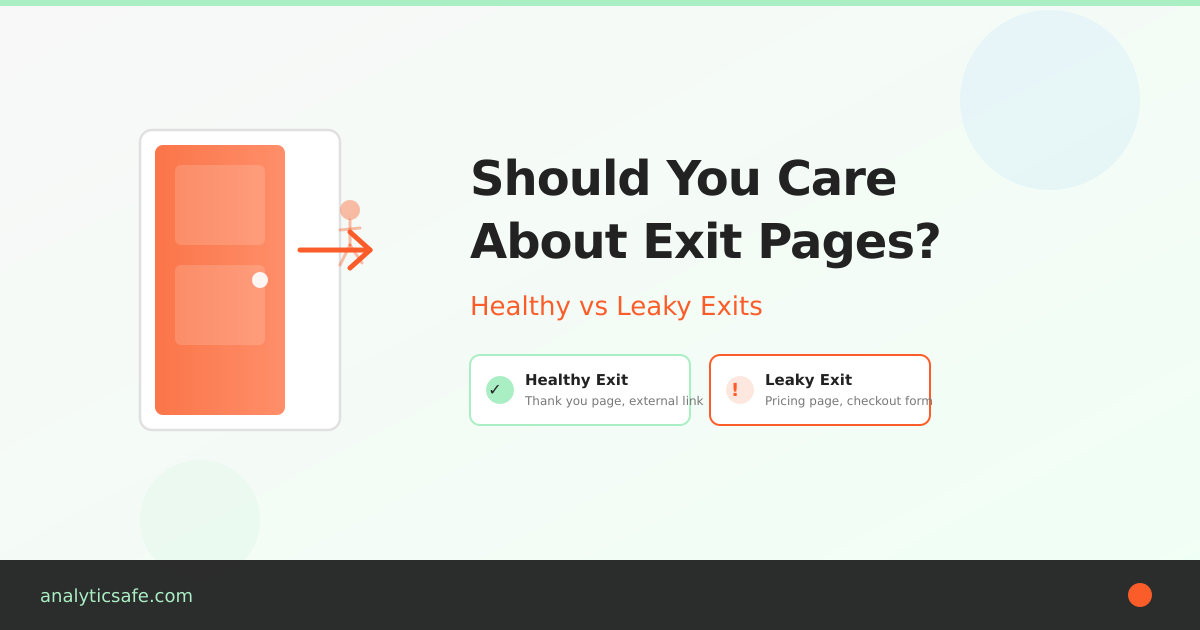
“Exit Pages” sounds ominous—like a list of places where your site fails. In reality, it’s just the last page in a session. Sometimes that’s a problem. Often, it’s perfectly normal. The trick is separating healthy exits (mission accomplished) from leaky exits (friction, confusion, dead ends).
Below is a beginner-friendly way to read the Exit Pages report without overreacting—and a simple table you can use to turn raw exits into clear next steps.
What an exit page actually tells you
- Definition: The exit page is the final page a visitor viewed before leaving your site. As Nielsen Norman Group explains, it simply marks the end of a session — not necessarily a failure.
- What it is not: It’s not automatically a “bad” page. People also exit after completing their goal—submitting a form, grabbing an address, or reading a single article.

Rule of thumb: Treat an exit as a context signal, not a verdict. Ask what the visitor came to do and whether this page logically ends that journey.
When exits are totally fine
- Receipt / thank-you pages. The “mission accomplished” exit.
- Contact details, store hours, directions. They found what they needed.
- Long-form content. Single-visit satisfaction is common for educational pieces.
- External handoffs. App store buttons, marketplace listings, or PDF downloads.

In these cases, a high exit rate is often a feature, not a bug.
When exits deserve attention
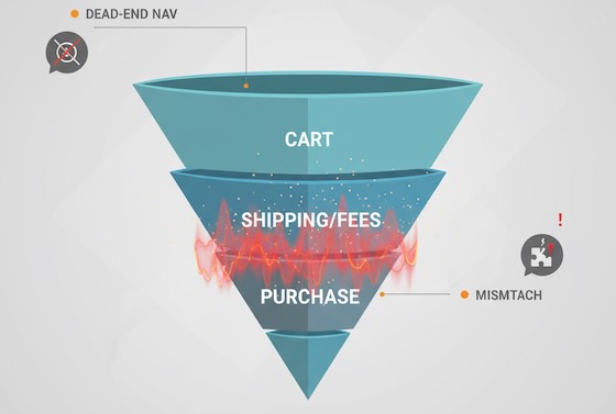
- Dead-end navigation. No obvious next step from high-intent pages (pricing, features, product pages).
- Friction moments. Sudden exits on shipping, fees, or error-prone forms. Baymard Institute research shows the average cart abandonment rate sits around 70%, with unexpected costs as the top reason.
- Mismatched promise. Ads or search results promise X; the landing page talks about Y.
- Thin or duplicate pages. Visitors bail because there’s no substance—or the same info appears elsewhere.

A quick reading framework for beginners
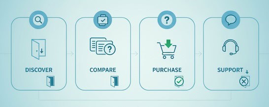
- Anchor to intent. What did this page promise in the journey (discovery, comparison, purchase, support)?
- Check it in context. Compare exits against other pages in the same intent bucket.
- Layer segments. New vs returning, device, traffic source. A pattern that’s invisible in aggregate often jumps out in segments.
- Look left and right. Pair exit rate with scroll depth (and consider running A/B tests with proper statistical significance), time on page, and click-through to primary CTA. A “high exit, high engagement” page is likely delivering value.

Translate exits into action (UX worksheet)
Use (or copy) this table to turn the Exit Pages report into a practical review list. It’s deliberately simple and avoids tools or implementation steps.

| Exit pattern (what you see) | Likely cause | What to review (UX view) | Healthy vs leaky? | Success metric to watch next time |
|---|---|---|---|---|
| High exits on Thank-You page | Goal completed | Is there a gentle next step? (account setup, resource link) | Healthy | % of visitors who take a post-conversion micro-step |
| High exits on Product page with low add-to-cart | Info gap or anxiety | Missing specs, price clarity, trust badges, reviews placement | Leaky | CTR to cart / request-info from the product page |
| Spike in exits on Shipping/fees step | Surprise costs | Fee disclosure timing, promo code friction, delivery estimates | Leaky | Completion rate for the next step; drop in abandonment |
| High exits on Blog post with long read time | Satisfied, no next path | End-of-post pathways: related posts, newsletter nudge | Usually healthy | CTR on end-of-post modules; newsletter sign-ups |
| High exits on Blog post with low scroll depth | Mismatch or weak intro | Headline relevance, first screen clarity, readability | Leaky | % reaching 50% depth; time to first interaction |
| Exits from Pricing page after 10–30s | Decision friction | Plan comparison clarity, FAQ above the fold, contact option | Leaky | Clicks to “Talk to sales”/trial; plan switch interactions |
| Mobile-only exit spikes | Mobile friction | Tap targets, font size, load time, sticky CTA visibility | Leaky | Mobile engagement rate; next-page CTR on mobile |
| Exits from Support articles | Problem solved | Add “Was this helpful?” and link to related fixes | Healthy | Helpful votes; reduction in repeat visits for same query |
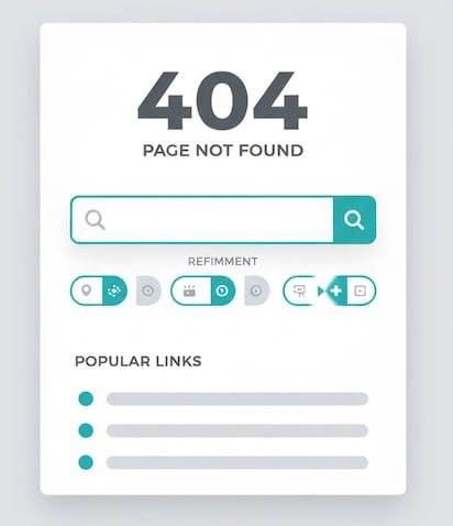
| Exits on 404 / no-results pages | Dead ends | Search refinement, popular links, clear language | Leaky | Recovery rate from 404 to any helpful page |

How to use it: Pick the top five exit pages by volume, identify their intent, choose a row above that matches the pattern, then define a single success metric to improve. You’ll move from “huh, lots of exits” to “we improved recovery from 404s by 22%.”
Reading exit pages alongside other beginner-friendly signals
- Scroll depth: Low depth + high exits = content didn’t hook. High depth + high exits = likely satisfied; add a next step.
- Time on page: Very short = mismatch or slow load; very long = confusion or deep engagement—check scroll and clicks.
- Click-through rate to next step: The clearest signal of progress; if it’s low on high-intent pages, prioritize those.
- Device split: If exits concentrate on mobile, suspect layout, speed, or input friction. Google’s Core Web Vitals guidelines are a good starting point for diagnosing mobile performance issues.
- Source/medium: High exits from a specific campaign hint at mismatch between ad promise and landing reality.
Common beginner mistakes with Exit Pages
- Treating all exits as failures. Many exits indicate success—don’t “fix” what isn’t broken.
- Ignoring volume. A 90% exit rate on a page with 30 visits isn’t the same as 70% on a page with 30,000. Prioritize impact.
- Skipping segmentation. Aggregate views hide mobile issues, new-user confusion, or campaign mismatches.
- Chasing tiny swings. Look for persistent patterns over time, not one-day blips.
- Optimizing without a success metric. Define the “next step” you want—newsletter click, product view, cart add—and measure that, not exit rate alone.
Quick diagnostic prompts (use them verbatim in your notes)
- “If this page did its job perfectly, what would the next click be?”
- “What promises got the visitor to this page, and does the first screen deliver on them?”
- “Is there at least one obvious path forward for each intent (learn, compare, act)?”
- “Would a first-time mobile visitor know what to do in three seconds?”
- “Are exits higher for one traffic source? If yes, what did that source promise?”
FAQ for newcomers
Is ‘exit rate’ the same as ‘bounce rate’?
No. Exit rate applies to any last page in a session. Bounce rate is a single-page session where the visitor leaves without another interaction — Google’s Analytics help docs cover the technical difference in detail. Both are key SEO behavioral factors that search engines track. A page can have a modest bounce rate but a high exit rate if many people reach it late in their journey.
What’s a “good” exit rate?
There’s no universal benchmark. Compare pages within the same intent (e.g., product pages vs product pages). Focus on improving the next-step CTR rather than hitting a magic exit percentage.
What if my top exit page is the homepage?
That often signals unfocused navigation or visitors who didn’t find a path. Check top on-page clicks, search usage, and mobile layout.
The takeaway
Exit pages aren’t a wall of shame—they’re a map of last touches — similar to how attribution models map the full customer journey. Read them through the lens of intent, pair them with simple engagement signals, and use a concise worksheet (like the table above) to decide whether you’re seeing healthy goodbyes or preventable drop-offs. Do that, and your Exit Pages report becomes less of a mystery and more of a to-do list that improves user experience.
