Form Abandonment: Why Users Bail and How to Fix It
Every form on your website is a promise: “fill this out, and you’ll get something valuable.” When users start a form but don’t finish it, that promise broke somewhere. Form abandonment is one of the most fixable conversion problems on the web — yet most businesses don’t even measure it. They track the final submission and ignore the 60-80% of users who gave up halfway through.
In my experience, reducing form abandonment by even 10-15% often delivers more revenue than driving the same percentage of additional traffic. The users are already there, already interested — they just hit friction. Understanding where and why they bail is the first step toward fixing it.
What Is Form Abandonment?
Form abandonment occurs when a user starts interacting with a form — clicking into a field, typing, or scrolling through it — but leaves the page without submitting. It’s different from simply ignoring a form. Abandonment implies intent that was lost.
The distinction matters because these are high-intent users. Someone who clicked into your checkout form, typed their name, and then left was much closer to converting than someone who bounced from your homepage. Consequently, recovering even a fraction of form abandoners has outsized impact on your bottom line.
How common is form abandonment?
Industry data paints a consistent picture:
| Form Type | Typical Abandonment Rate | Top Reason |
|---|---|---|
| Checkout forms | 65-75% | Unexpected costs |
| Lead generation | 50-65% | Too many fields |
| Registration forms | 40-55% | Mandatory account creation |
| Contact forms | 30-45% | Privacy concerns |
| Survey forms | 55-70% | Length and fatigue |
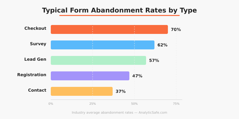
These numbers are averages. Your actual rates depend on form length, design, industry, and device. However, the pattern is clear: a significant percentage of interested users never complete the forms they start.
Why Users Abandon Forms
Understanding the reasons behind form abandonment is essential before attempting fixes. In my work with e-commerce and SaaS clients, I’ve identified several consistent patterns.
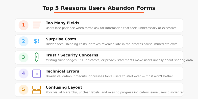
Too many fields
This is the most common culprit. Research from the Baymard Institute shows that the average checkout contains 23 form elements — nearly double what’s actually needed. Every additional field increases cognitive load and gives users another reason to reconsider.
I once worked with a B2B client whose lead generation form had 14 fields. After cutting it to 5 essential fields (name, email, company, role, message), their completion rate jumped from 22% to 41%. They lost some data granularity but gained nearly twice the leads. The trade-off was worth it every time.
Surprise costs or requirements
For checkout forms specifically, unexpected shipping costs, taxes, or mandatory account creation cause immediate abandonment. Users feel deceived when the total at checkout doesn’t match their expectation. Therefore, showing all costs upfront — before the form — reduces abandonment significantly.
Trust and security concerns
Users hesitate when forms ask for sensitive information without adequate trust signals. Phone numbers, credit card details, and government IDs trigger caution. If your form requests this data without explaining why or showing security indicators, expect higher abandonment.
Additionally, privacy-conscious users may abandon forms that lack clear data handling policies. With GDPR awareness growing, more people think twice before sharing personal information. A brief note explaining what you’ll do with their data can reduce this friction.
Technical friction
Slow-loading forms, confusing error messages, and poor mobile formatting all contribute to abandonment. Specifically, inline validation that only shows errors after submission frustrates users. Real-time validation — showing a green check or red warning as users fill each field — significantly reduces this problem.
Complexity and confusion
Forms that require users to format data in specific ways (phone numbers, dates, postal codes) create unnecessary friction. Similarly, unclear labels, missing placeholder text, and ambiguous field requirements make users uncertain about what’s expected. When users feel uncertain, they leave.
How to Measure Form Abandonment
You can’t fix what you don’t measure. Here’s how to track form abandonment effectively without compromising user privacy.
Field-level tracking
Basic form submission tracking only tells you the completion rate. Field-level tracking reveals where users drop off within the form. You can implement this by firing events when users interact with each field.
For instance, if 80% of users fill in their email but only 50% complete the phone number field, the phone field is your primary friction point. This granular data turns a vague problem into a specific, actionable one.
Privacy-respecting tools can track field interactions without capturing the actual data entered. You’re measuring the pattern of engagement, not the personal information itself. This approach aligns well with privacy-first analytics principles.
Session recordings (with consent)
Tools like Hotjar or open-source alternatives like OpenReplay let you watch anonymized recordings of form interactions. These reveal hesitation patterns, error corrections, and confusion points that quantitative data alone can’t show.
However, always obtain explicit consent before recording user sessions. This is both a legal requirement under GDPR and an ethical obligation. In my practice, I recommend clear opt-in notices and automatic masking of all form field inputs in recordings.
Creating a measurement framework
Track these metrics for each important form:
| Metric | What It Tells You | Benchmark |
|---|---|---|
| Form start rate | % of page visitors who interact with the form | Varies (30-70%) |
| Field drop-off rate | % who abandon at each specific field | Under 10% per field |
| Completion rate | % of starters who submit successfully | 40-60% (non-checkout) |
| Error rate | % of submissions with validation errors | Under 15% |
| Time to complete | Average seconds from first field to submission | Depends on form length |
This framework connects directly to micro conversion tracking. Each field interaction is a micro conversion that moves users toward the macro goal of form submission.
How to Reduce Form Abandonment
Based on years of working with clients across industries, here are the fixes that consistently deliver results.
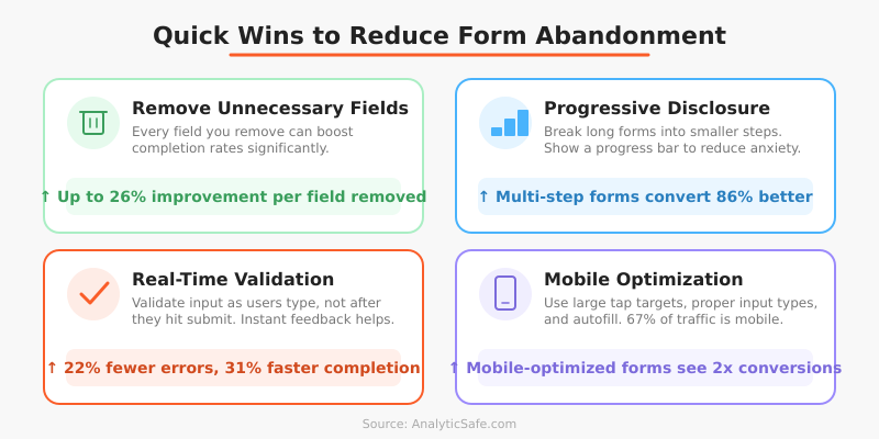
Remove unnecessary fields
Start with a simple question for every field: “Do we need this information to process this request?” If the answer is “it would be nice to have” rather than “we absolutely need it,” remove the field. You can always collect additional data later in the relationship.
Specifically, I recommend this prioritization:
- Essential: Fields required to deliver the service (email for digital products, address for shipping)
- Helpful: Fields that improve service but aren’t strictly necessary (phone number for order updates)
- Nice-to-have: Fields for segmentation or marketing (job title, company size, how did you hear about us)
Move category 3 out of the form entirely. Category 2 should be optional. Only category 1 stays required.
Use progressive disclosure
Instead of showing all fields at once, break long forms into steps. A multi-step form that shows 3-4 fields per screen feels less overwhelming than a single page with 12 fields — even though the total work is identical.
Moreover, add a progress indicator. Users who can see “Step 2 of 3” are more likely to continue than those facing an endless-seeming form. The Nielsen Norman Group research on progress indicators confirms this pattern consistently.
Show costs and requirements upfront
For checkout forms, display the total cost (including shipping and taxes) before users enter the form. For registration forms, clearly state what account creation requires. Eliminating surprises reduces the most emotional form of abandonment — the feeling of being tricked.
Implement smart defaults and autofill
Pre-fill fields where possible. Country selection based on IP, postal code lookup for addresses, and supporting browser autofill all reduce effort. Every keystroke you eliminate is one less opportunity for the user to reconsider.
Fix mobile form experience
Mobile form abandonment rates are consistently 10-15% higher than desktop. The reasons are physical: smaller screens, touch keyboards, and frequent interruptions. Therefore, ensure your forms use appropriate input types (type="email", type="tel"), have large enough tap targets, and don’t require horizontal scrolling.
Add real-time validation
Validate inputs as users type, not after they submit. Nothing frustrates users more than filling out 10 fields, clicking submit, and getting an error message that scrolls them back to field 3. Inline validation catches errors immediately and reduces submission failure rates dramatically.
Testing Form Changes with A/B Tests
Before overhauling your forms, test changes systematically. Form optimization pairs naturally with A/B testing methodology. Run controlled experiments on specific changes rather than redesigning everything at once.
Effective form A/B tests I’ve run with clients include:
- Removing one specific field (phone number, company name)
- Changing a multi-page form to single-page (or vice versa)
- Adding trust badges near the submit button
- Changing submit button text (“Submit” vs. “Get your free quote”)
- Adding a progress bar to multi-step forms
Test one change at a time. Otherwise, you won’t know which modification drove the improvement. In my experience, field removal tests deliver the fastest, clearest results — cutting one unnecessary field typically improves completion by 5-10%.
Common Mistakes When Fixing Form Abandonment
I’ve seen teams make these errors repeatedly when trying to reduce form abandonment.
Making everything optional
Marking all fields as optional doesn’t solve the problem — it just confuses users. They wonder “if this field isn’t required, why is it here?” Instead, remove truly unnecessary fields entirely. If a field is worth keeping, make it required and explain why it’s needed.
Adding too many trust signals
Ironically, overloading a form with security badges, certification logos, and reassurance text can make users more anxious, not less. One or two well-placed trust indicators work better than ten. A simple padlock icon and a brief privacy statement usually suffice.
Ignoring error state design
Many teams optimize the “happy path” but neglect error states. What happens when a credit card is declined? When an email format is wrong? When a required field is missed? These moments are where abandonment often happens. Therefore, invest as much design effort in error states as in the ideal flow.
Not segmenting by device
Desktop and mobile form abandonment often have completely different causes. A form that works perfectly on desktop might be unusable on mobile. Always analyze form performance separately by device type before drawing conclusions.
Bottom Line
Form abandonment is a conversion leak that most businesses underestimate. The users who start your forms are already interested — they’ve demonstrated intent by engaging with the form in the first place. When they leave without completing it, something in your form pushed them away.
Start by measuring where users drop off. Then apply the fixes that match your specific friction points: reduce fields, show costs upfront, fix mobile experience, and add real-time validation. Test each change individually and measure the impact on completion rates.
The math is simple: if 1,000 users start your form monthly and 40% complete it, improving completion to 50% gives you 100 additional conversions — without spending a cent on additional traffic. That’s why form optimization often delivers the highest ROI of any conversion improvement you can make.