Most analytics tools show you what happened yesterday. Cohort analysis shows you what happens over time — to the same group of people. That distinction matters more than most marketers realize. Instead of asking “how many users converted last week,” cohort analysis asks “of the users who signed up in January, how many are still active in March?”
In my experience, this shift in perspective transforms how teams think about retention, churn, and long-term value. I’ve worked with SaaS and e-commerce clients who were celebrating growing traffic while their cohort data revealed a leaky bucket — new users kept arriving, but older ones kept leaving. Without cohort analysis, they never would have noticed.
What Is Cohort Analysis?
A cohort is a group of users who share a common characteristic within a defined time period. Usually, that characteristic is the date they first visited your site, signed up, or made a purchase. Cohort analysis then tracks how each group behaves over subsequent weeks or months.
For example, you might define a cohort as “all users who created an account in February 2026.” Then you track what percentage of that cohort returns in week 1, week 2, week 4, and so on. The result is a retention curve — one of the most powerful diagnostic tools in analytics.
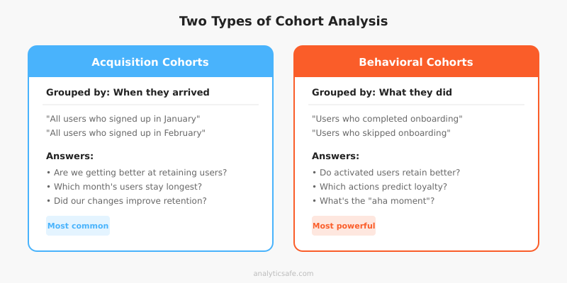
There are two main types of cohorts:
- Acquisition cohorts: Grouped by when users first arrived. This is the most common type and answers “are we getting better at retaining new users?”
- Behavioral cohorts: Grouped by an action users took, such as completing onboarding or making a first purchase. These answer “do users who take action X retain better than those who don’t?”
Why Cohort Analysis Matters
Aggregate metrics hide trends. If your overall monthly active users stay flat, that could mean two very different things: either your retention is stable, or you’re losing old users at the same rate you’re acquiring new ones. Cohort analysis separates these signals.
It reveals retention problems early
When I set up cohort tracking for a SaaS client, we discovered that users who signed up during a promotional campaign had 40% worse retention than organic signups. The aggregate numbers looked fine because the promo drove enough volume to mask the drop-off. However, cohort data made the problem obvious within two weeks.
Consequently, they adjusted their onboarding flow for promotional users and improved retention by 15 percentage points. Without cohort analysis, they would have kept running the same campaign and wondering why churn was creeping up.
It measures the impact of changes
Did your new onboarding flow actually improve retention? Aggregate metrics can’t answer this cleanly because they mix old and new users. Cohort analysis can — you simply compare pre-change cohorts with post-change cohorts. If the March cohort retains better than the February cohort, your change likely worked.
This approach pairs well with proper A/B testing methodology. While A/B tests measure immediate conversion impact, cohort analysis reveals whether those gains persist over time.
It connects acquisition to long-term value
Not all traffic sources deliver equal long-term value. Cohort analysis can show that users from organic search retain at 35% after 90 days, while users from paid social retain at only 12%. This insight directly impacts budget allocation and attribution model decisions.
How to Build a Basic Cohort Analysis
You don’t need expensive tools to start. A spreadsheet works for basic cohort analysis. Here’s the step-by-step process I use with clients.
Step 1: Define your cohort
Choose how you’ll group users. The most common approach is by acquisition week or month. For a SaaS product, the signup date works well. For e-commerce, the first purchase date is often more meaningful.
Be specific about what qualifies as the cohort event. “First visit” is too loose if you’re using privacy-respecting tools that don’t track individual sessions. Instead, use a concrete action like “account created” or “first order placed.”
Step 2: Choose your metric
What behavior will you track over time? Common choices include:
| Business Type | Cohort Metric | What It Tells You |
|---|---|---|
| SaaS | Weekly active users | Product stickiness |
| E-commerce | Repeat purchase rate | Customer loyalty |
| Content site | Return visit rate | Content engagement |
| Mobile app | Daily active users | Habit formation |
| Subscription | Renewal rate | Perceived value |
Step 3: Build the retention table
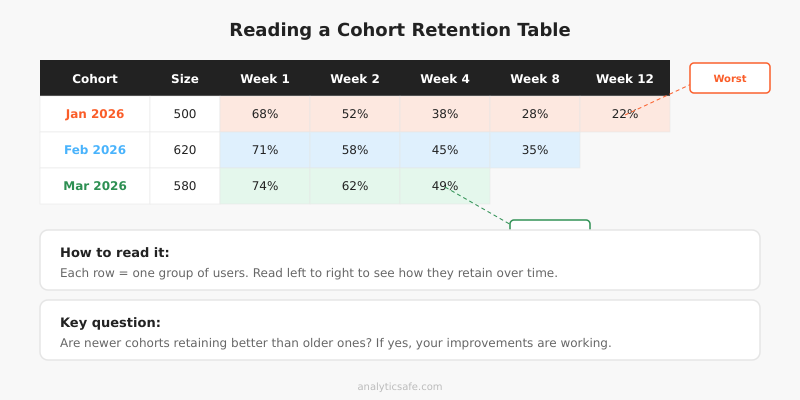
A cohort retention table shows each cohort as a row and each time period as a column. The cells contain the percentage of the original cohort still active in that period.
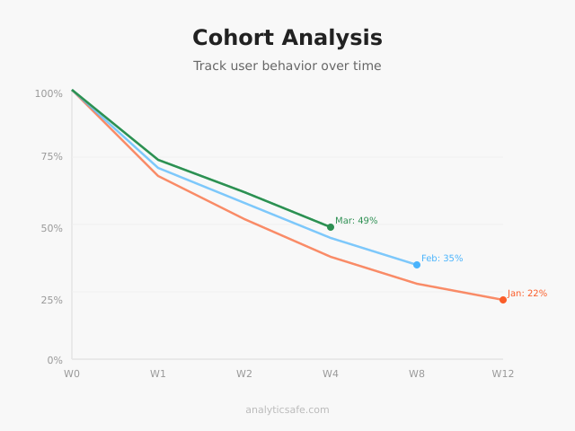
Here’s a simplified example for a SaaS product:
| Cohort | Size | Week 1 | Week 2 | Week 4 | Week 8 | Week 12 |
|---|---|---|---|---|---|---|
| Jan 2026 | 500 | 68% | 52% | 38% | 28% | 22% |
| Feb 2026 | 620 | 71% | 58% | 45% | 35% | — |
| Mar 2026 | 580 | 74% | 62% | 49% | — | — |
In this example, each successive cohort retains better — a clear sign that product improvements are working. The March cohort shows 49% retention at week 4, compared to January’s 38%. That’s meaningful progress.
Step 4: Visualize the curves
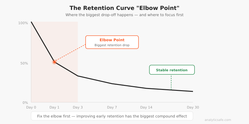
Plot each cohort as a line on a chart. The x-axis shows time since the cohort event, and the y-axis shows the retention percentage. Healthy products show curves that flatten over time rather than continuously declining.
Additionally, look for the “elbow point” — the moment where the steepest drop-off occurs. For most products, this happens in the first week. Improving that early retention has the biggest impact on long-term numbers.
Cohort Analysis with Privacy-First Tools
You might wonder whether cohort analysis conflicts with privacy-focused analytics. It depends on your approach. Traditional cohort analysis relies on tracking individual users across sessions, which requires cookies or user IDs. However, privacy-respecting alternatives exist.
Aggregate cohort approaches
Tools like Plausible and Fathom don’t track individual users, so traditional cohort analysis isn’t possible. Instead, you can build cohorts from your own first-party data — CRM records, email signups, purchase history — without relying on browser-level tracking.
For instance, if someone creates an account, you already have their signup date in your database. You can build cohort reports from that data without any third-party tracking. This approach respects privacy while still delivering the insights you need.
Server-side cohort tracking
Matomo (self-hosted) offers built-in cohort reports while keeping all data on your servers. Since you control the data entirely, this satisfies GDPR requirements without sending user data to third parties. In my experience, Matomo’s cohort visualization is genuinely useful — it generates the retention table automatically and lets you segment by traffic source, device, and location.
Common Cohort Analysis Mistakes
After helping numerous businesses set up cohort tracking, I’ve noticed several recurring errors that lead to wrong conclusions.
Using cohorts that are too small
A cohort of 30 users will show wildly fluctuating retention rates that mean nothing. You need sufficient volume for patterns to emerge. As a rule of thumb, I recommend at least 100 users per cohort for weekly analysis and 300+ for monthly analysis. Smaller cohorts produce noise, not signal.
Ignoring seasonality
A December e-commerce cohort will behave differently from a June cohort simply because of holiday shopping patterns. Therefore, compare cohorts from similar periods year-over-year rather than month-over-month. Alternatively, control for seasonality by comparing against the same month in the previous year.
Confusing correlation with causation
If the March cohort retains better than February, that could be due to your product changes — or it could be because March attracted a different type of user. Always consider what else changed between cohorts. Ideally, pair cohort analysis with controlled experiments to establish causation.
Only tracking one metric
Retention rate alone doesn’t tell the full story. A cohort might have high retention but low engagement — users keep their accounts but barely use the product. Track at least two metrics: a retention metric and an engagement or revenue metric. This prevents optimizing for vanity numbers.
Forgetting to act on insights
I’ve seen teams build beautiful cohort dashboards that nobody uses. Cohort analysis is only valuable if it drives decisions. Specifically, connect each insight to an action: “Cohort retention drops 30% in week 2 → investigate onboarding completion → improve step 3 of the setup flow.”
Practical Applications by Business Type
Cohort analysis looks different depending on your business model. Here’s how I apply it across common scenarios.
SaaS and subscription products
For SaaS businesses, cohort analysis is essential for understanding churn. Track monthly cohorts by signup date and measure weekly active usage. The key insight is usually in the first 7 days — users who don’t engage within the first week rarely come back.
Additionally, segment cohorts by acquisition source. In my work with SaaS clients, organic search cohorts typically show 2-3x better retention than paid advertising cohorts. This information directly affects customer acquisition cost calculations and budget decisions.
E-commerce
For online stores, track cohorts by first purchase date and measure repeat purchase rate. Most e-commerce businesses find that getting the second purchase is the hardest part — first-to-second purchase conversion is often below 25%. Cohort analysis helps you understand the typical timeline for repeat purchases and optimize your email sequences accordingly.
Tracking micro conversions within cohorts adds another dimension. You can identify which early behaviors (creating a wishlist, using search filters, reading reviews) predict higher lifetime value.
Content and media sites
For content sites, the relevant cohort metric is return visit rate. Group users by the week they first visited and track how many return in subsequent weeks. Content sites with strong editorial quality typically see a “reader loyalty curve” where retention stabilizes around 15-20% after the initial drop-off.
Moreover, segmenting cohorts by the content type they first encountered reveals which topics create loyal readers versus one-time visitors. This insight shapes your editorial calendar more effectively than raw pageview data ever could.
Tools for Cohort Analysis
Several tools support cohort analysis with different trade-offs:
| Tool | Privacy | Cohort Features | Best For |
|---|---|---|---|
| Matomo | Self-hosted, GDPR OK | Built-in retention tables | Full-featured privacy analytics |
| PostHog | Self-hosted option | Advanced cohort builder | Product analytics |
| Amplitude | Cloud, US-based | Behavioral cohorts | Mobile and web apps |
| Spreadsheet | Fully controlled | Manual but flexible | Small scale, custom needs |
For privacy-conscious teams, I typically recommend starting with Matomo or PostHog (self-hosted). Both offer genuine cohort analysis while keeping data under your control. If you need a simpler approach, exporting first-party data to a spreadsheet works surprisingly well for businesses with fewer than 10,000 monthly signups.
Bottom Line
Cohort analysis answers questions that aggregate metrics simply cannot. It tells you whether your product is genuinely improving, which user segments retain best, and where the critical drop-off points are. Without it, you’re making decisions based on averages that hide more than they reveal.
Start simple: define your cohorts by signup or first purchase date, pick one retention metric, and build a basic retention table. You don’t need fancy tools — a spreadsheet and your own first-party data are enough to surface the patterns that matter. Once you see your first cohort curve flatten (or decline), you’ll understand why this analysis is worth the effort.
The businesses that grow sustainably share one trait: they obsess over retention, not just acquisition. Cohort analysis is how you measure retention honestly. Use it, and you’ll stop celebrating vanity metrics and start fixing the leaks that actually matter.